case study · February 2026 · 7 min read
Tracely. Designing an ethical field force tracking system.
Designing a field-force management platform that helps managers gain operational visibility without creating a surveillance-heavy employee experience.
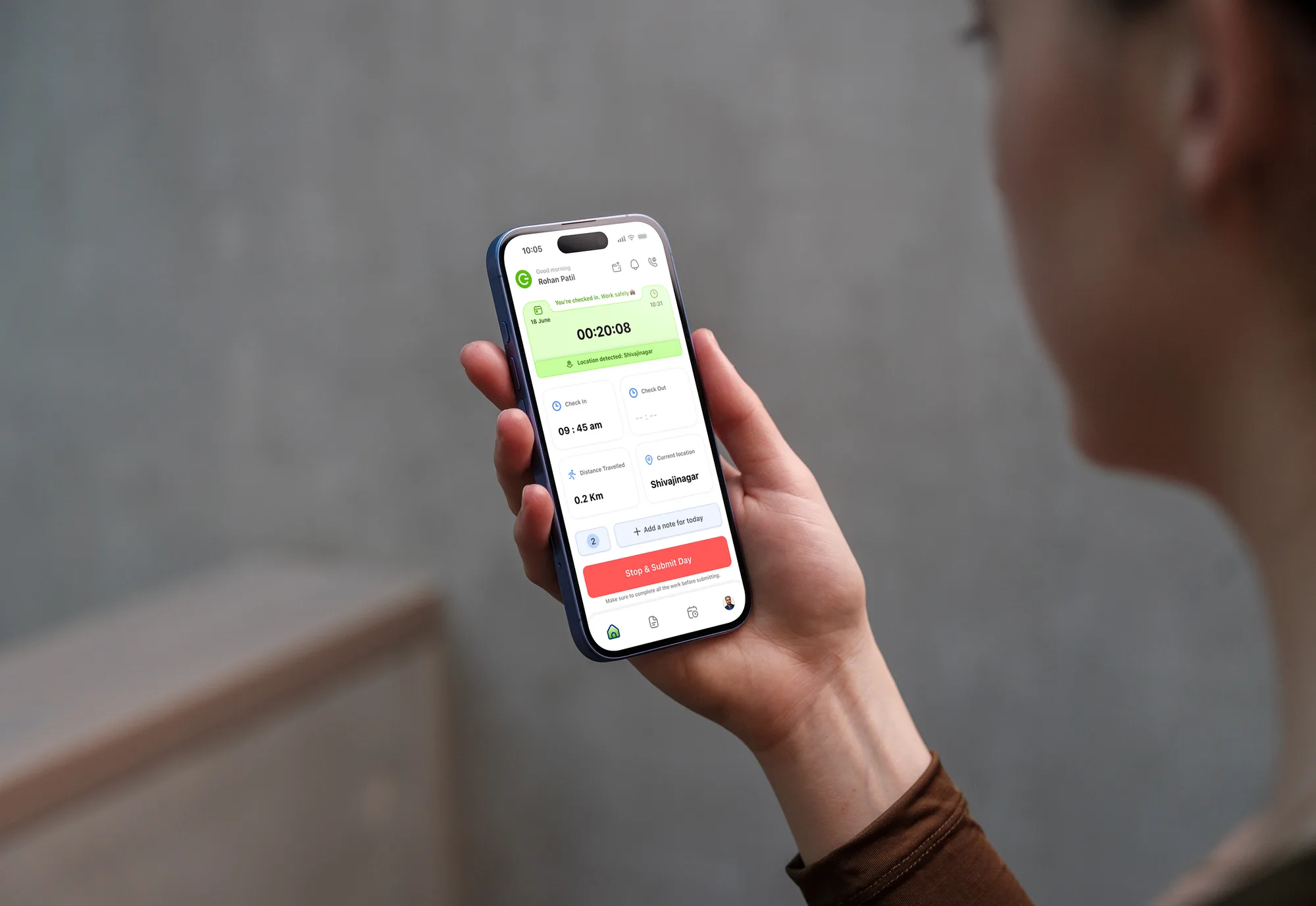
The Challenge
Every evening, managers faced the same question:
“What actually happened in the field today?”
The answers were often scattered across phone calls, WhatsApp messages, spreadsheets, and manual updates. Without a clear view of ongoing work, managers struggled to identify delays, support field employees, or make timely operational decisions.
At the same time, many field employees associated tracking systems with surveillance rather than support. Constant monitoring often created discomfort, reduced trust, and added friction to their daily work.
The challenge wasn’t simply designing another employee tracking application.
It was creating a product that gave managers meaningful operational visibility while ensuring employees felt supported, not watched.
That balance became the foundation for every design decision throughout this project.
Why This Problem Matters
Field operations directly influence customer experience, service quality, and business efficiency. When managers lack visibility into ongoing work, small issues often become larger operational problems before anyone notices.
Traditional tracking tools attempt to solve this by collecting more data. However, more data doesn’t always lead to better decisions. In many cases, it creates information overload for managers while making employees feel constantly monitored.
The opportunity wasn’t to collect more information.
It was to provide the right information at the right time, helping managers make faster decisions without compromising employee trust.
Understanding the Current Workflow
Before exploring solutions, I wanted to understand how field operations were actually managed on a day-to-day basis.
The goal wasn’t simply to digitize an existing process. It was to identify where communication broke down, why managers struggled to make timely decisions, and what created friction for employees in the field.
By mapping the existing workflow, it became clear that information moved through multiple disconnected channels before reaching managers. Updates were often delayed, inconsistent, or missing entirely, making it difficult to understand the real status of ongoing work.
This meant managers spent more time collecting information than acting on it.
Rather than asking, “How do we track employees?”, the more valuable question became:
How might we give managers better operational visibility while respecting employees’ autonomy?
What We Discovered
Through stakeholder discussions, workflow analysis, and studying existing field operations, several recurring patterns began to emerge.
Although managers and field employees had different responsibilities, both groups were experiencing frustrations caused by the same fragmented workflow.
Instead of lacking effort, they lacked shared visibility into what was happening across the day.
These observations became the foundation for the product strategy.
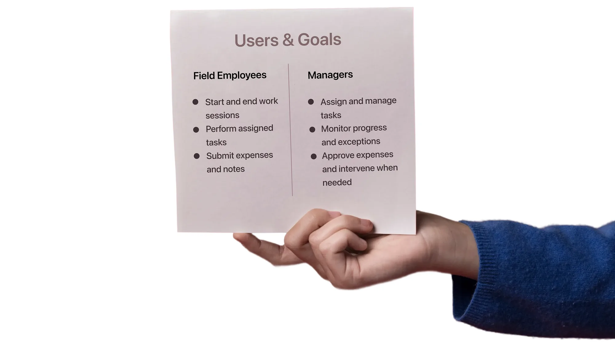
Who We Were Designing For
Field Managers
Managers needed to:
- Understand work progress without repeatedly calling employees.
- Identify delays before they affected customers.
- Approve expenses efficiently.
- Gain visibility without creating unnecessary oversight.
Field Employees
Employees needed to:
- Start their day quickly.
- Update work without repetitive reporting.
- Submit expenses easily.
- Feel trusted instead of constantly monitored.
The Core Product Challenge
This project wasn’t solving a single problem. It was balancing competing needs across two very different user groups.Three tensions repeatedly appeared throughout the research.
1. Visibility vs Trust
Managers needed greater visibility into work happening in the field.
Employees needed confidence that the product existed to support their work — not monitor every movement.
2. Data vs Action
Managers weren’t struggling because they lacked data.
They struggled because they couldn’t quickly identify what required attention.
The challenge wasn’t collecting more information.
It was surfacing meaningful information.
3. Reporting vs Productivity
Employees shouldn’t spend significant time documenting work.
Reporting should become a natural outcome of completing work — not an additional task.
Design Principles
Every design decision throughout the project was evaluated against three principles.
Build trust before introducing visibility.
Employees should always understand what information is being shared and why.
Reduce operational complexity.
Managers should spend less time collecting updates and more time making decisions.
Support work instead of monitoring it.
The product should help employees complete their responsibilities — not feel like surveillance software.
From Insights to Product Strategy
Research uncovered several operational challenges, but not every problem needed a feature.
Instead of trying to solve everything at once, I prioritized the decisions that would have the greatest impact on both managers and field employees.
Rather than asking “What features should we add?”, I focused on “What decisions do users need to make throughout their day?”
This shift helped transform the product from a tracking application into a decision-support tool.
The product strategy was built around three simple stages.
Product Strategy
Visibility
Users should always know what is happening without needing to search for information.
Context
Information should explain why something happened — not just display raw data.
Action
Every important insight should help users decide what to do next.
Instead of creating dashboards full of information, the experience was designed to surface the information that required attention.
Structuring the Experience
Instead of designing around features, I structured the experience around the natural workflow of both user groups.
Although managers and employees interacted with the same system, they had very different goals.
This led to two connected but distinct experiences.
Field Employee Experience
Focused on helping employees complete their daily work with minimal reporting overhead.
Primary tasks included:
- Starting the workday
- Managing assigned tasks
- Recording visits
- Submitting expenses
- Ending the workday
Manager Dashboard
Focused on helping managers monitor operations and make timely decisions.
Primary tasks included:
- Reviewing team activity
- Monitoring ongoing work
- Approving expenses
- Identifying blockers
- Supporting field teams
Rather than exposing every piece of information to everyone, each interface was designed around the decisions its users needed to make.
Key Product Decisions
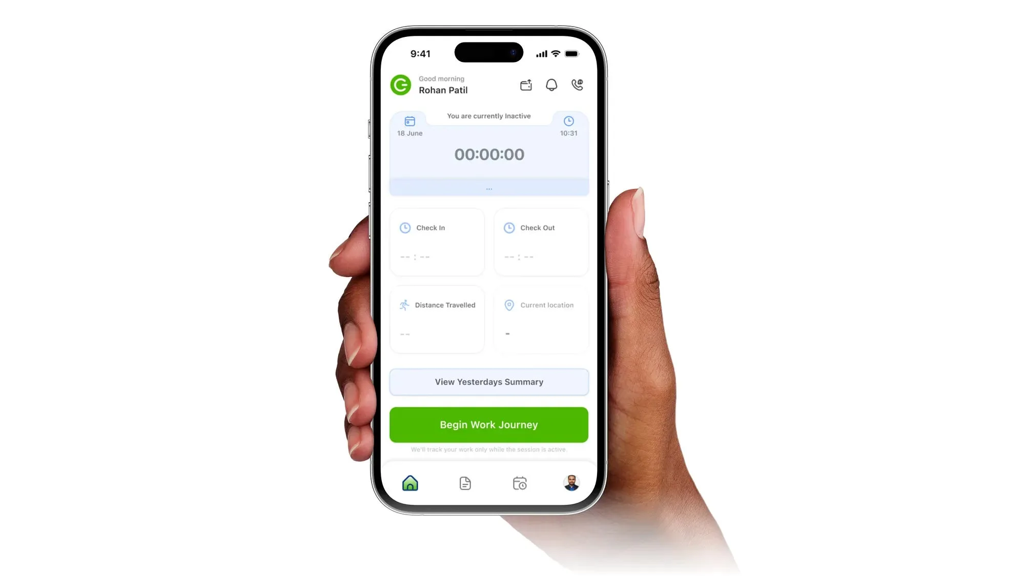
Decision 01Employees choose when their workday begins
Problem
Continuous tracking creates uncertainty and reduces trust between employees and managers.
Design Decision
Instead of automatically tracking activity, employees explicitly begin their workday by starting a work session.
Tracking only occurs during active working hours.
Why it Matters
This creates a clear boundary between work and personal time while giving managers reliable operational visibility.
Decision 02Focus attention on exceptions instead of everything
Problem
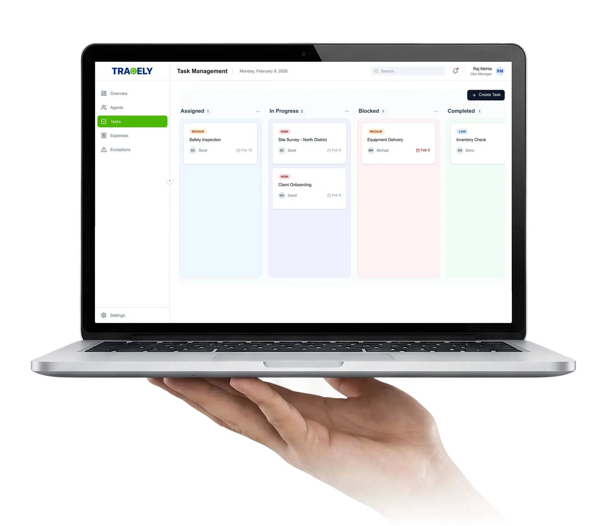
Managers don’t have time to monitor every employee equally.
Most work progresses normally.
Only a small percentage requires intervention.
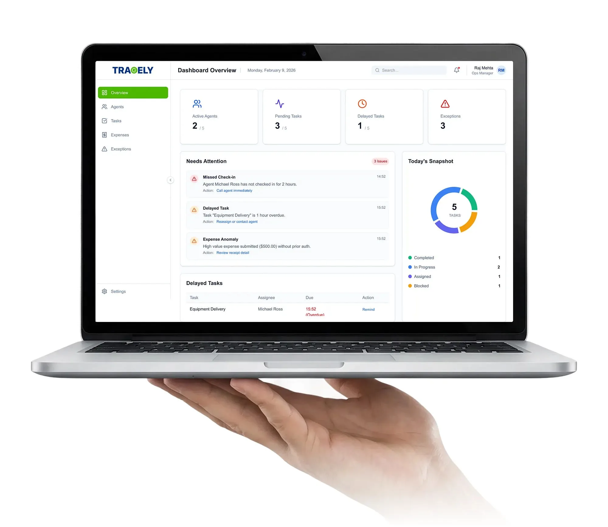
Design Decision
The dashboard prioritizes delays, blocked tasks, and pending approvals before routine updates.
Why it Matters
Managers spend less time searching for problems and more time solving them.
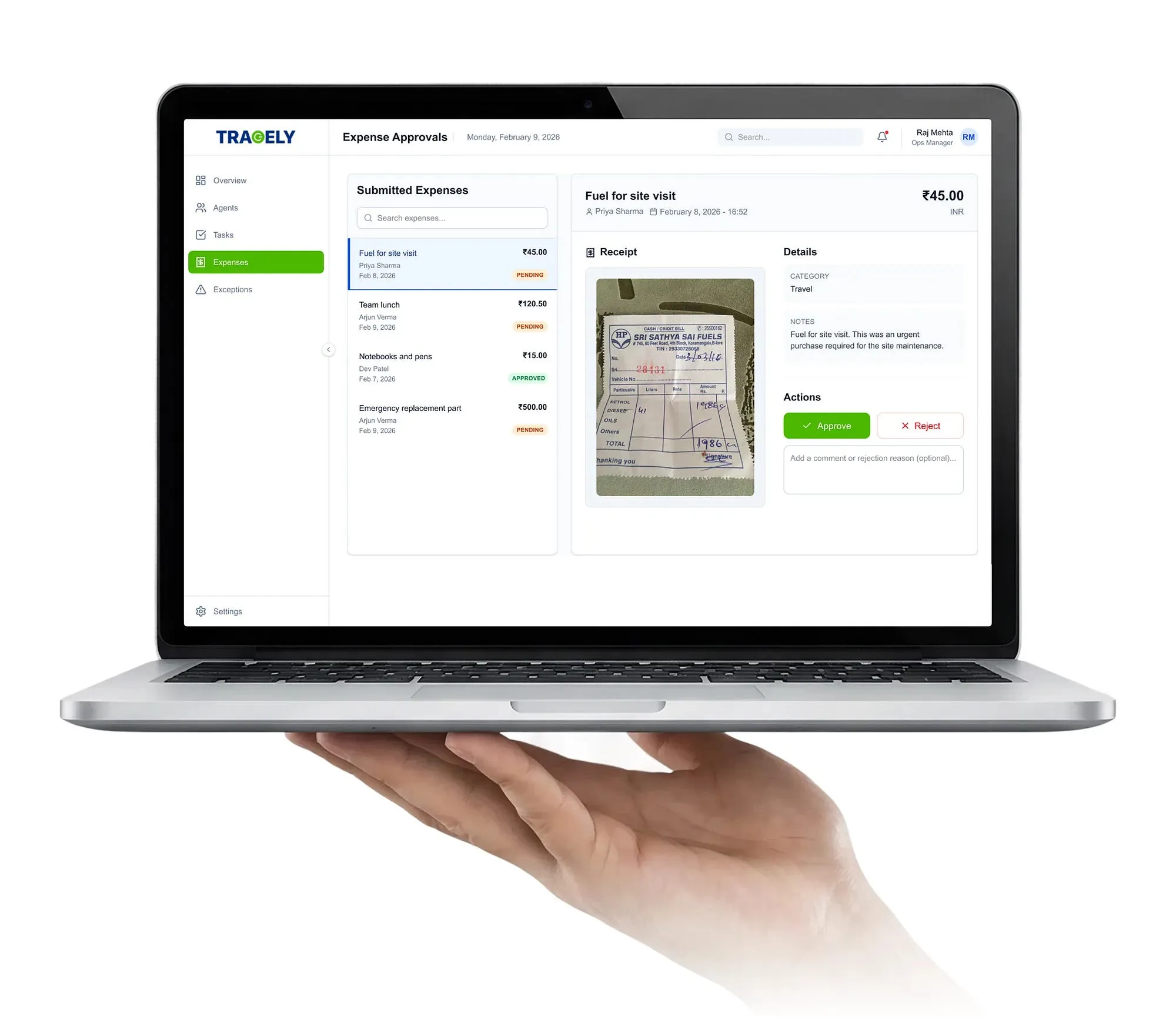
Decision 03Expense reporting should happen naturally
Problem
Employees often postpone expense reporting because it interrupts their workflow.
Design Decision
Expense submission was integrated directly into the work session instead of becoming a separate task.
Why it Matters
Reducing reporting friction increases reporting consistency.
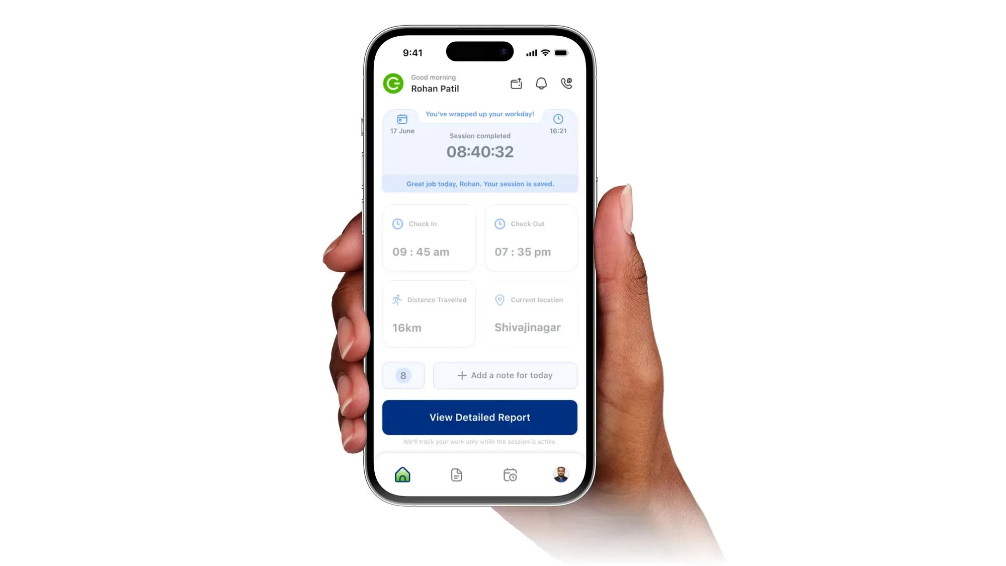
Decision 04Daily summaries instead of continuous reporting
Problem
Managers needed a reliable understanding of each employee’s daily progress, but frequent manual updates interrupted work and often resulted in incomplete or inconsistent reporting.
Continuous reporting also increased cognitive load for employees, making documentation feel like an administrative burden rather than part of their workflow.
Design Decision
Instead of asking employees to constantly report their activities, the experience was designed around meaningful milestones throughout the workday.
At the end of each work session, employees review and submit a concise daily summary that captures completed tasks, expenses, notes, and overall progress in one place.
Why it Matters
This approach reduces interruptions during the day while giving managers a clear overview of completed work.
Employees spend less time reporting, and managers receive structured information that’s easier to review and act upon.
Decision 05Operational visibility without surveillance
Problem
Many employee tracking solutions prioritize monitoring over support, creating an experience that can feel intrusive and reduce trust between employees and managers.
When employees feel watched rather than supported, adoption and engagement often decline.
Design Decision
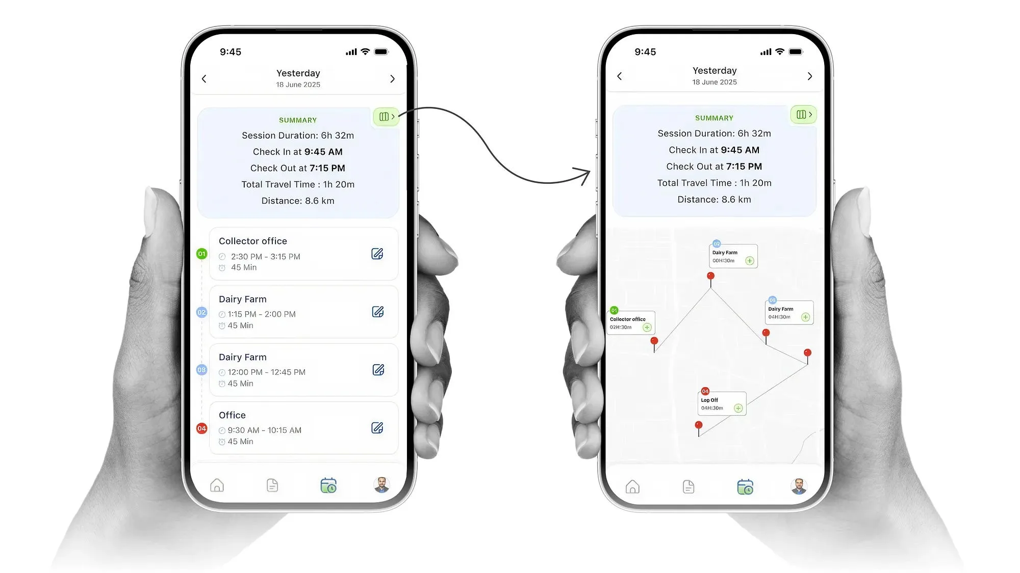
Instead of emphasizing live tracking, the product focuses on operational transparency.
Managers gain visibility through work sessions, task progress, completed activities, submitted expenses, and contextual updates — rather than constant location monitoring.
The interface was intentionally designed to communicate progress instead of surveillance.
Why it Matters
Managers receive the operational insights they need to make informed decisions, while employees retain a greater sense of autonomy and ownership over their work.
The result is a product that encourages accountability through transparency rather than control.
Expected Product Impact
The solution was designed to improve both operational efficiency and the daily experience of field employees by balancing visibility with trust.
Instead of introducing more monitoring, the product focused on helping both user groups make better decisions with less effort.
For Managers
- Gain a clear overview of ongoing field operations.
- Identify delays and blockers earlier.
- Reduce dependency on manual follow-ups.
- Review expenses and daily progress more efficiently.
For Field Employees
- Spend less time on repetitive reporting.
- Complete daily tasks with fewer interruptions.
- Understand exactly what information is shared.
- Feel supported rather than constantly monitored.
For the Business
- Better operational transparency.
- Faster issue resolution.
- More consistent reporting.
- Improved collaboration between managers and field teams.
Key Learnings
This project challenged me to think beyond interface design and focus on how product decisions influence user behavior, operational efficiency, and trust.
Three lessons stood out throughout the project.
1. Visibility doesn’t require surveillance.
The initial instinct was to improve visibility by exposing more information.
However, research showed that managers didn’t need more data — they needed better context.
Designing for clarity proved more valuable than designing for control.
Many interface decisions became significantly easier once the core product principles were established.
Rather than asking which screen should come next, I focused on what users were trying to accomplish at each stage of their workflow.
The interface naturally followed those decisions.
3. Trust is a product feature.
Trust isn’t created by adding another screen or interaction.
It’s built through small product decisions that help users understand what information is collected, why it’s needed, and how it benefits them.
Designing with trust in mind ultimately created a stronger experience for both managers and employees.
Looking Back
If I had another iteration of this project, there are several areas I would explore further.
Validate with real field teams
While the solution was grounded in research and workflow analysis, observing long-term adoption would provide valuable insights into how employees interact with the product over time.
Measure operational outcomes
Future iterations should evaluate how the platform influences reporting consistency, task completion rates, and managerial decision-making.
These metrics would help validate whether the design successfully improves day-to-day operations.
Continue reducing reporting friction
Reporting should feel like a natural outcome of completing work — not an additional responsibility.
I’d continue exploring ways to automate updates while maintaining transparency and user control.
Final Thoughts
Designing Tracely wasn’t about creating another field-force management application.
It was about finding the balance between operational visibility and employee trust.
Throughout the project, every design decision was evaluated against one question:
Does this help people make better decisions without adding unnecessary complexity?
That principle shaped the product from research through implementation and remains the biggest lesson I take forward into future product design challenges.